Mood boards, going beyond digital
March 31, 2021
Find out how to create a mood board that will bring your dream interior to life.
Whether you’re working with an interior designer or redecorating for yourself, explaining your ideas to someone else can be the best way to clarify what you’re trying to do and transform the ideas from your mind out into the real world. For many, online has been the most opportune source of inspiration for the past year, but it’s time to source the most inspiring and tactile materials out there.
When gathering your project ideas, it’s easy (and tempting) to use images found online. However, with greater thirst for touch, smell and texture, we are seeing more and more creative ways to deliver a project outline and sometimes a less obvious illustration can give a stronger sense of the desired style.
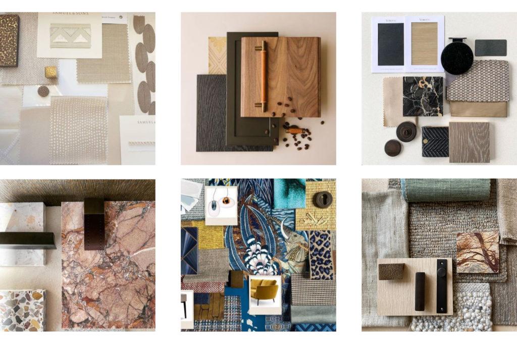
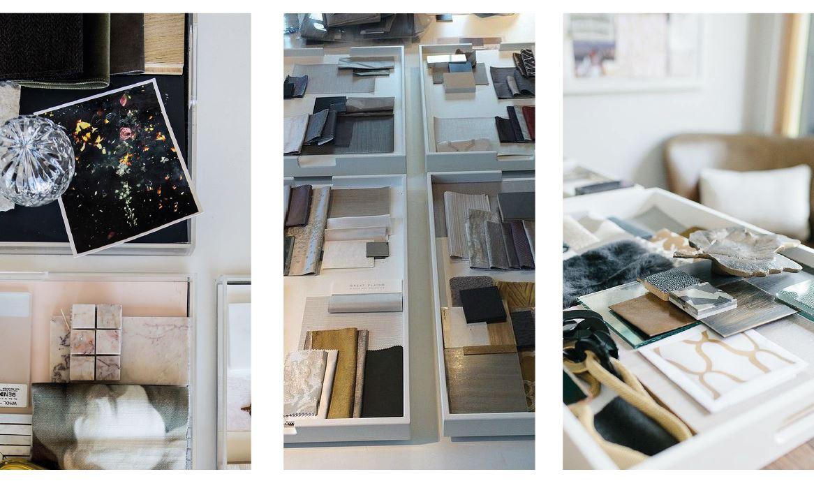
Historically, mood boards were created using bulletin boards or Foamex as a base. With materials as a backing, usually with pinned or stapled photographs, yarn, sprigs of herbs or other plants, and anything else used to plan a project. But as creativity reaches new limits, there is a growing trend that goes beyond the board, using trays, boxes, walls, shelves and other creative backdrops.
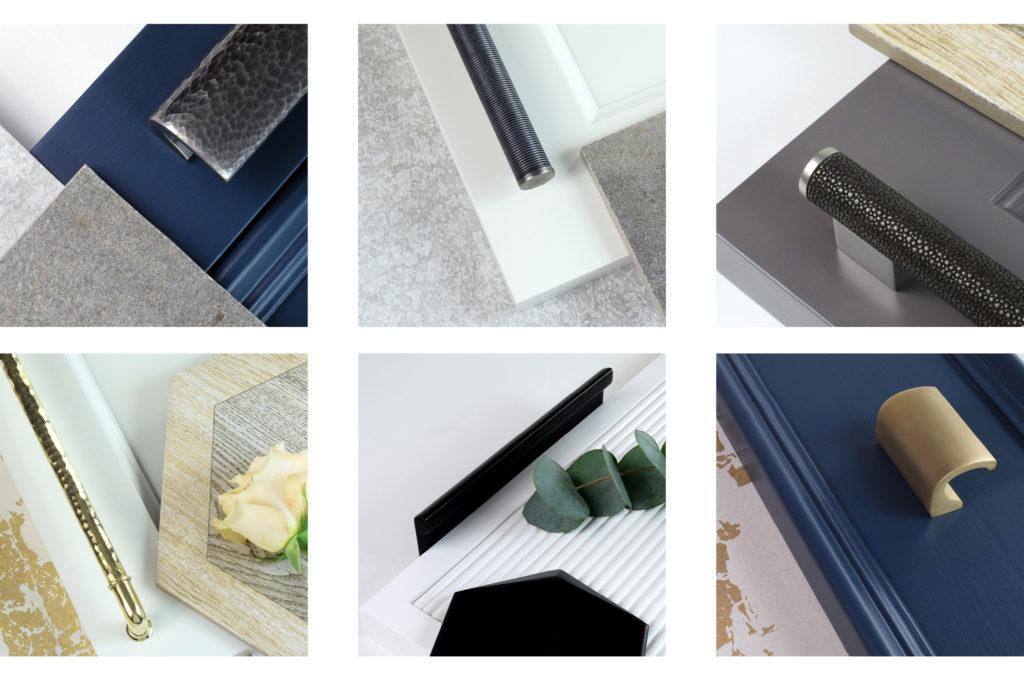
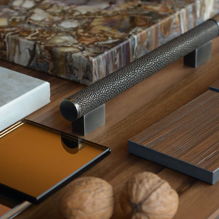
In the past fixtures and fittings, have been left entirely off of these presentations, partly due to the weight and the swatch sizes. With a different setting for presentations, we are seeing more and more luxury handles, T bars, pull handles and levers presented alongside flooring and soft furnishing swatches. With something as important as interior jewellery, which will often make or break a project, it will serve you well not to leave these until last.
Interior designer Kelly Wearstler uses the term ‘vibe trays’, which she calls physical trays with samples of textures, fabrics, and materials, to organize her projects. She often uses full-sized handles and pulls in her trays, alongside larger material swatches. She likes to size the swatches based on the use of the material within the space, to gauge balance. This can be a really impactful way to demonstrate your ideas, to either lock in the style you’re going for in your own home, or deliver a client proposal.
The first step in creating your board, tray or however you want to present it, is to gather your materials. The best designs are not repetition but rather inspired by a conversation with what is out there. You may find yourself stuck with multiple directions or simply ‘inspiration overload’. If this is the case, a good way forward is to tell yourself ‘you’ll use what you’re editing out for other projects’ and cut away at the mood board until you have only the essential design elements. Less can really be more, especially with these ‘living’ boards. Give your ideas room to breathe and you could leave your ideas for a day or two, to let your thoughts settle.
Once you’ve nailed your chosen materials and begin to lay them out, try to think of the board or tray as the base of your room and stack from the ground up. Start with flooring samples, then materials for the other surfaces. Once you have the foundation, you can mix and match handles, hooks and tapware in brass, copper, wood, leather or stainless steel to create a cohesive look. Do not leave these vital fixtures out, the metal and harder items can make the biggest impact.
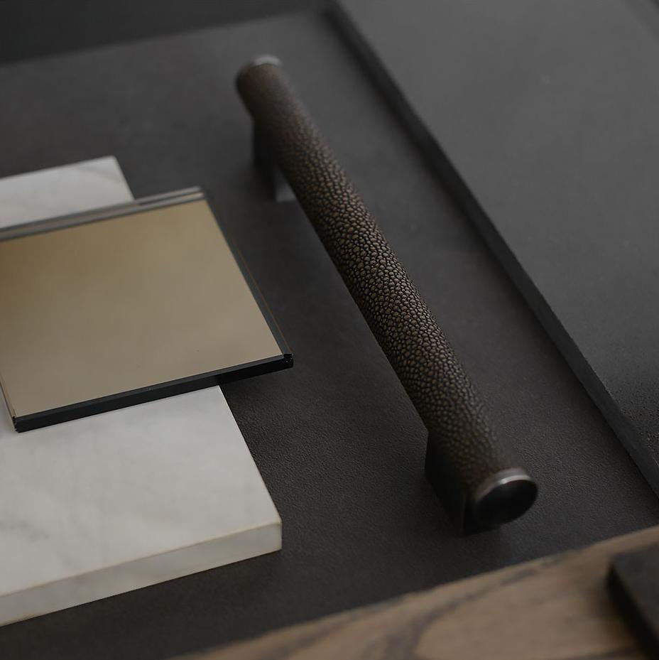
We offer an extensive range of different and unique finishes. From leather to sold and hammered brass, as well as our unique Amalfine™ material, which is made from a secret recipe of marble dust, metals and resin. You can fully suite your hardware with our ranges, contrasting or matching with other fittings. We also have design combinations, where you can personally select a mixture or the finishes, for a unique design. Being creative at this stage with your hardware will allow you to decorate, with an established palette in place.


